Header
Let's start by creating a header component for our theme. Generally speaking, a header should consist of a brand logo/name, some sort of a navigation structure, search functionality, and some links to account pages. We will provide simple versions of these features, and explain what more you can do to improve your header at the end.
Here is the full source code. Here is how our header will look like;

Props
In order to achieve the end result in the screenshot, we need to ask the merchant for some prop values in the theme editor. We need the image for the logo and the links to be provided by the merchant.
We select Image and Link List data types from the editor when we create these props. Here is how the generated type looks like.
export type HeaderProps = {
  logo: IkasImage;
  links?: IkasNavigationLink[];
};
Here is how the header component looks like. We have created seperate components for the mobile and desktop versions.
function Header(props: HeaderProps) {
  ...
  if (isMobile) return <MobileHeader {...props} />;
  return <DesktopHeader {...props} />;
}
DesktopHeader
Let's examine the DesktopHeader to see how the image and links we received from the merchant is being rendered.
DesktopHeader starts by creating the layout of the header, splitting it into 3 parts.
It also has a LocalizationBar sub-component to allow the customers to switch to
a route for their country.
- LeftSide contains the logo
- Center contains the links and the search input.
- RightSide contains icon buttons that links to the account pages.
function DesktopHeader(props: HeaderProps) {
  return (
    <>
      {props.showLocalization && <LocalizationBar {...props.localization} />}
      <S.Header>
        <Container>
          <S.InnerContainer>
            <LeftSide {...props} />
            <Center {...props} />
            <RightSide {...props} />
          </S.InnerContainer>
        </Container>
      </S.Header>
    </>
  );
}
LeftSide
Here we render the logo we received from the merchant.
For small sized images like this you can use the basic img
tag, instead of the Image component.
logo prop we have is an instance of IkasImage.
This class has an src field and a thumbnailSrc field. We use the latter here,
because the logo itself is small in size, therefore we don't need a big resolution for the logo.
thumbnailSrc provides as a small resolution image, making it a better choice to render the logo.
const LeftSide = (props: HeaderProps) => {
  return (
    <S.LeftSide>
      <Link href="/">
        <S.Logo>
          <img src={props.logo.src} />
        </S.Logo>
      </Link>
    </S.LeftSide>
  );
};
Center
Here we render the navigation links and a search input.
const Center = (props: HeaderProps) => {
  return (
    <S.Center>
      <Navigation {...props} />
      <SearchInput {...props} />
    </S.Center>
  );
};
The links prop we receive from the merchant is an array of IkasNavigationLink.
Our navigation structure allows rendering one level of sublinks.
Parent link will be rendered on the header bar itself, and its sublinks
are rendered in a popup menu, which will be displayed when the parent link is hovered.
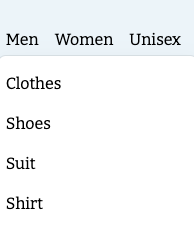
Here is how it looks when the Men link is hovered.
We start by rendering the parent links on the header bar, by mapping over the props.links
Each item uses the Link component to render the link, as decribed in the Link prop type.
Then we do the same mapping, but this time its on the link.sublinks. Each sublink is rendered as a list item,
and they will only become visible when the parent link is hovered.
const Navigation = (props: HeaderProps) => {
  return (
    <S.Navigation>
      <S.NavigationList>
        {props.links?.map((link, index) => (
          <S.NavigationListItem key={index}>
            <Link href={link.href} passHref>
              {link.label}
            </Link>
            {!!link.subLinks.length && (
              <S.NavigationItemDropdown>
                <S.NavigationItemDropdownList>
                  {link.subLinks.map((subLink, subIndex) => (
                    <S.NavigationItemDropdownListItem key={subIndex}>
                      <Link href={subLink.href} passHref>
                        {subLink.label}
                      </Link>
                    </S.NavigationItemDropdownListItem>
                  ))}
                </S.NavigationItemDropdownList>
              </S.NavigationItemDropdown>
            )}
          </S.NavigationListItem>
        ))}
      </S.NavigationList>
    </S.Navigation>
  );
};
RightSide
RightSide is rendering 2 buttons that links to the account pages; favorites and login page. It also renders a cart button that links to the cart page. It also shows the current cart's item count, by accessing the cart from the Cart Store.
const RightSide = observer((props: HeaderProps) => {
  const store = useStore();
  const router = useRouter();
  const quantity = store.cartStore.cart?.itemQuantity ?? 0;
  return (
    <S.RightSide>
      <S.FavoriteWrapper>
        <FavoriteSVG />
      </S.FavoriteWrapper>
      <Link href="/account" passHref>
        <S.AccountWrapper as="a">
          <AccountSVG />
        </S.AccountWrapper>
      </Link>
      <S.CartWrapper
        onClick={() => {
          store.cartStore.checkoutUrl && router.push(store.cartStore.checkoutUrl);
        }}
      >
        <S.CartQuantity>{quantity}</S.CartQuantity>
        <CartSVG />
      </S.CartWrapper>
    </S.RightSide>
  );
});
LocalizationBar
This sub-component allows the customers to switch to their country specific url path. ikas merchants can create rules for different countries; they can change the pricing, the locale of the theme for specific countries etc from the Storefront Localization page. To enforce these rules, we show a bar to suggest the customers to switch to their own country route.

To render the options for the dropdown, we use the useStore hook to get an instance of the Ikas Base Store. We use the following field/functions from this class to provide this functionality;
- showLocaleOptions to decide whether or not to show the bar itself. If the customer is already in the correct path for their country, there is no need to show this bar.
- localeOptions to render the options available in the dropdown. This field is an array of type IkasLocaleOption.
- setLocalization to select and redirect the customer to the correct route.
Check the useLocalization hook to see the complete logic for this bar
Improvements
Our header is a pretty basic one. Your headers on the other hand, might have more features in its design. Here are the few things you can do to improve your headers;
- Ask for a
Positionprop to modify the layout of the header links. - Ask for a few boolean props to toggle visibility of search input, the 3 buttons on the right side etc.
- Create a Custom Data combining an Image with Link List to allow displaying an image for a major link. For example, if the merchant is selling computer parts, he/she might want to display an image for each major category of links.
- Ask for a Product List prop with
Searchtype to render the search results directly in the header, instead of navigating to the search page.