Introduction
To display product details and add products to the cart, every theme should have a Product Detail component.
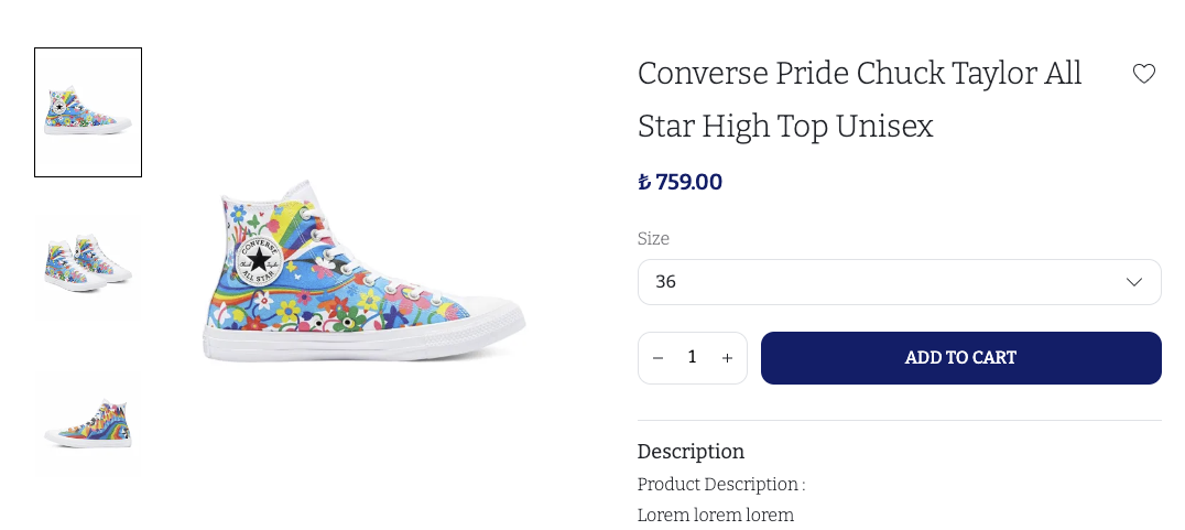
Here is the full source code. Here is how our product detail will look like;
Since there is a lot to cover in the product detail component, we split it into several parts, both in code and in documentation.
Props
In order to achieve the end result in the screenshot, we need to ask the merchant for a Product Prop.
Here is how the generated type looks like.
export type ProductDetailProps = {
  product: IkasProduct;
};
Here is how the top-level product detail component looks like. It splits into 2 main components, Slider and Detail.
function ProductDetail(props: ProductDetailProps) {
  return (
    <S.ProductDetail>
      <Container>
        <S.InnerContainer>
          <Slider {...props} />
          <Detail {...props} />
        </S.InnerContainer>
      </Container>
    </S.ProductDetail>
  );
}
Slider renders the images you see on the left side of the screenshot. It basically renders the images by using the selectedVariant.images from the product object.
The Detail component on the other hand, renders everything else about the product. Here is the render method;
function Detail(props: ProductDetailProps) {
  return (
    <S.Wrapper>
      <Title {...props} />
      <FavoriteButton {...props} />
      <Price {...props} />
      <Variants {...props} />
      <ProductOptions {...props} />
      <AddToCart {...props} />
      <Description {...props} />
      <SocialShare {...props} />
    </S.Wrapper>
  );
}
As you can see, it also splits into different parts, but this render method should give you a basic idea as to what is being displayed. In the next sections, we go into detail for each of these sub-components.