Variants
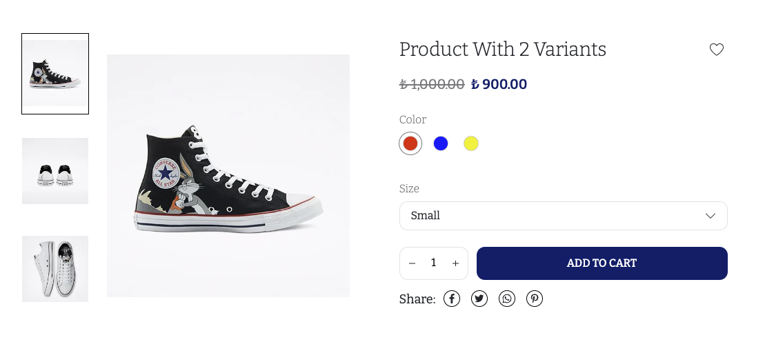
We allow the merchants to select variants in this sub-component. Here is how a product with 2 variants, Color and Size, looks like;

As you can see in the screenshot, we have a color selector, and a dropdown for the size variant type. To render each variant type, we use the displayedVariantTypes field of the product. This field does some filtering / ordering of the variant types, in accordance with the merchant's arrangement of the variant types from the dashboard. displayedVariantTypes corresponds to the Color or Size sections you see on the screenshot.
export const Variants = observer(({ product }: ProductDetailProps) => {
  return (
    <S.VariantsWrapper>
      {product.displayedVariantTypes.map((dVT) => (
        <VariantType key={dVT.variantType.id} product={product} dVT={dVT} />
      ))}
    </S.VariantsWrapper>
  );
});
warning
Do not use the variantTypes field of the product to render the variant types manually, unless you are absolutely sure about what you are doing.
Use the displayedVariantTypes field instead.
We render the name of the variant type, then render all the variant values under.
const VariantType = observer(({ dVT, product }: VariantTypeProps) => {
  return (
    <S.VariantType>
      <S.VariantTypeName>{dVT.variantType.name}</S.VariantTypeName>
      <VariantValues dVT={dVT} product={product} />
    </S.VariantType>
  );
});
const VariantValues = observer(({ dVT, product }: VariantValueType) => {
  const onVariantValueChange = (dVV: IkasDisplayedVariantValue) => {
    product.selectVariantValue(dVV.variantValue);
  };

  if (dVT.variantType.isColorSelection) {
    return <SwatchVariantValue dVT={dVT} onVariantValueChange={onVariantValueChange} />;
  }
  return <SelectVariantValue product={product} dVT={dVT} onVariantValueChange={onVariantValueChange} />;
});
Notice how we switch between different display types, by checking the isColorSelection field. The Selection Style logic is explained in the Variant Type page.
We also use the selectVariantValue function of the product
when a new value is selected by the merchant. We pass the clicked variantValue
object into this function. When this function is called, the selectedVariant field
will be updated for you, and your component will re-render for the new variant automatically,
if you wrapped your components with observer,
as mentioned in the Creating Component Files.
Here is how the select and swatch variant values are being rendered;
const SelectVariantValue = observer(({ dVT, product, onVariantValueChange }: SelectVariantValueProps) => {
  const { t } = useTranslation();

  const selectOptions = dVT.displayedVariantValues.map((dVV) => ({
    value: dVV.variantValue.id,
    label: dVV.variantValue.name,
  }));

  const selectValue = product.selectedVariantValues.find((sVV) => sVV.variantTypeId === dVT.variantType.id)?.id;

  const onChange = (value: SelectOnChangeParamType) => {
    const dVV = dVT.displayedVariantValues.find((dVV) => dVV.variantValue.id === value);
    dVV && onVariantValueChange(dVV);
  };

  return (
    <Select
      placeholder={t(`${NS}:detail.variantType.selectPlaceholder`)}
      options={selectOptions}
      value={selectValue}
      onChange={onChange}
    />
  );
});
const SwatchVariantValue = observer(({ dVT, onVariantValueChange }: SwatchVariantValueProps) => {
  return (
    <>
      {dVT.displayedVariantValues.map((dVV) => (
        <Swatch
          key={dVV.variantValue.id}
          title={dVV.variantValue.name}
          selected={dVV.isSelected}
          image={dVV.variantValue.thumbnailImage}
          colorCode={dVV.variantValue.colorCode}
          onClick={() => onVariantValueChange(dVV)}
        />
      ))}
    </>
  );
});
The main thing to note here is we use the displayedVariantValues field to render each variant value. This corresponds to the each color you see on the screenshot, or each item in the dropdown. As mentioned above, when an item is clicked, we just pass the clicked variantValue (dVV) item of the array.
note
The Swatch component renders either a color, or an image. Merchants can either select colors for the color variant types, or upload a thumbnailImage to indicate the color/material of the variant. Your components should cover both cases, as you see in our swatch component.